

Hermanas Perales – Consulting Firm Branding
Hermanas Perales is a consulting firm founded by two sisters, built on experience, strategy, and meaningful guidance. The brand embodies collaboration, structure, and the power of process to help businesses thrive.

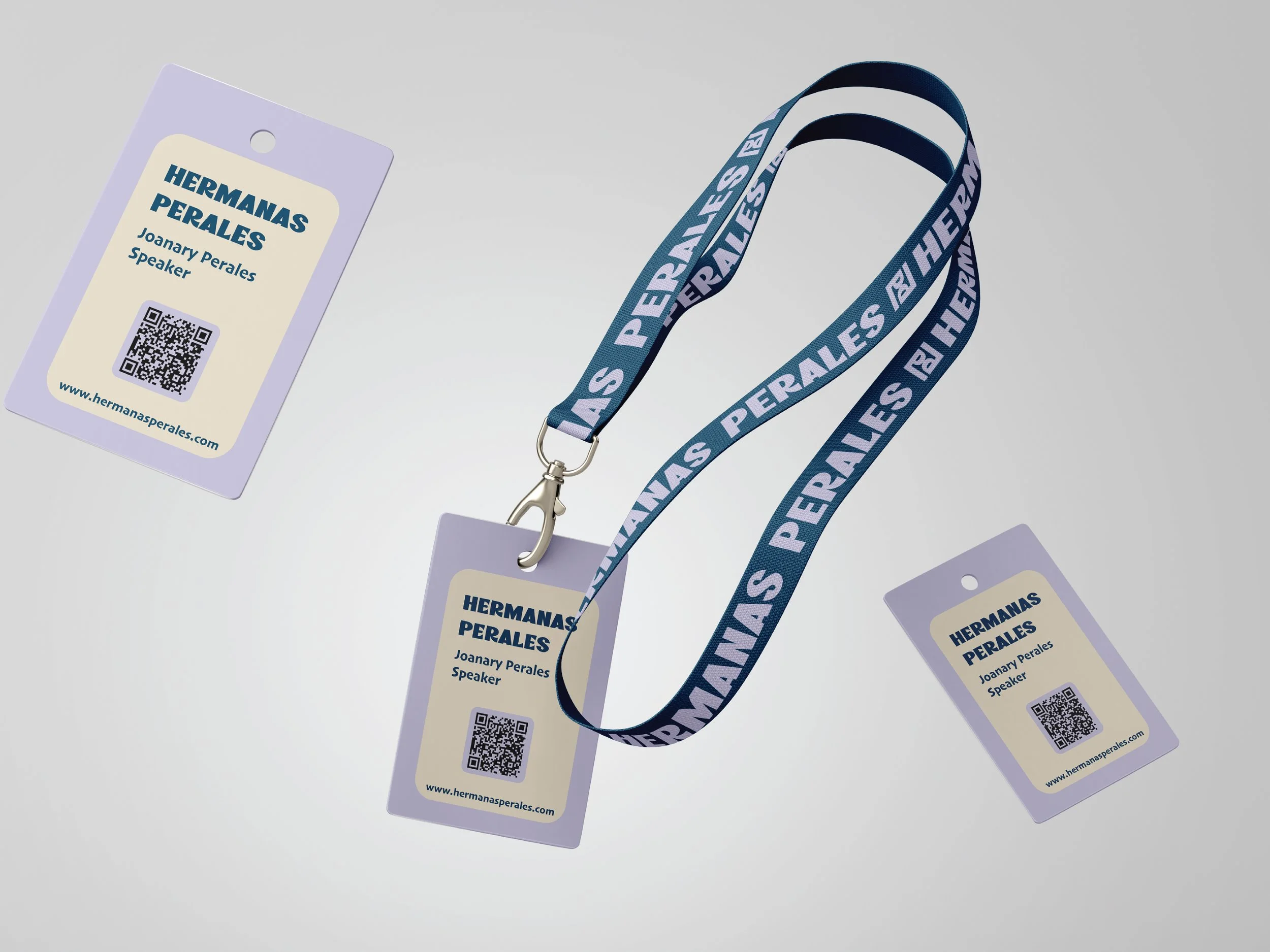
The goal was to create a visual identity that reflects professionalism, trust, and the sisters’ commitment to guiding businesses toward sustainable success.
The Challenge
We designed a logo featuring two mirrored “P”s forming an hourglass, symbolizing time, balance, and structured growth. Combined with a clean, professional color palette and typography, the brand communicates reliability and strategic expertise.
The Solution

The branding positions Hermanas Perales as a trusted partner for businesses, highlighting their ability to provide tailored guidance, actionable strategies, and meaningful support for growth.
The Result


Looking for branding that reflects expertise, strategy, and trust?